This is a post on the EIA Short Term Energy Outlook March 2015 (STEO).
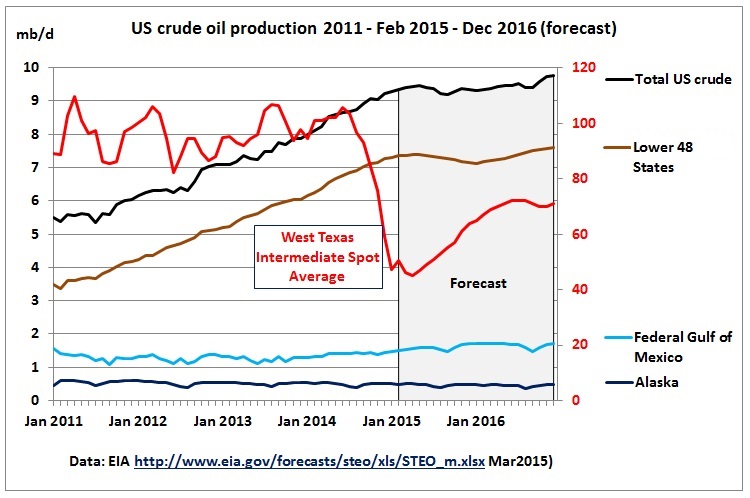
The following graph shows total US crude production according to EIA statistics until Feb 2015 and then a forecast until Dec 2016. A clear kink in the production curve can be seen in the 2nd quarter of 2015. An increase of production is only expected by the end of 2016 following a recovery of oil prices to a $70 range.
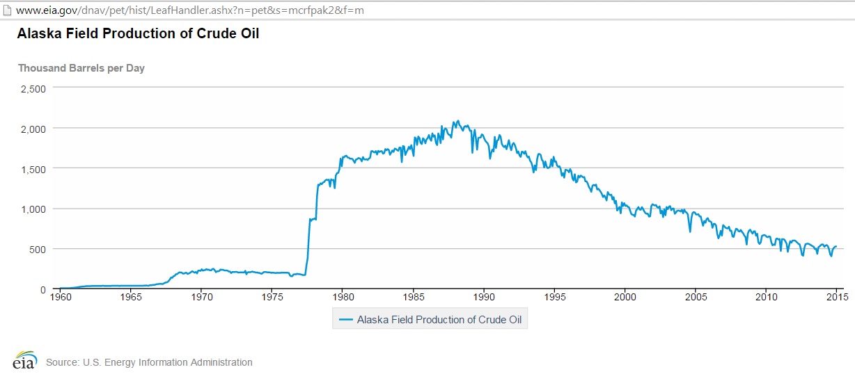
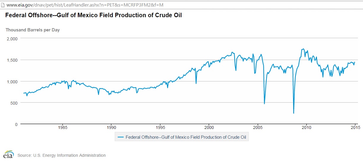
We see a 10 month time delay between the sharp drop in oil prices and the peaking of US crude oil production expected by EIA in May 2015. The main battle is fought in the tight oil fields of the lower 48 States (brown line) because Alaska (dark blue) and the Gulf of Mexico (light blue) are hovering around the 2.1 mb/d mark (see Appendix)
The EIA assumes that oil prices start to increase again by mid 2015 and reach $70 a barrel by April 2016. That would result in tight oil production to pick up again, albeit at a smaller annual growth rate (6% in 2016) than the one experienced when oil prices were around $100 in 2014 (20%).
Now let’s have a look at how EIA’s data and forecasts have changed since oil prices started to drop. First we see that actual (some of it still estimated) Lower 48 production was higher (solid brown line) than anticipated (doted brown line). But due to the peaking the Mar 2015 forecast for end 2015 is lower than the Jul 2014 forecast.
Fig 2: Comparison EIA’s ESTO July 2014 vs March 2015
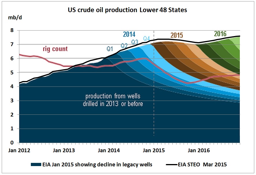
Fig 3: US lower 48 production showing decline in legacy wells (January 2015)
The superimposition shows that the STEO Mar 2015 is slightly higher than the January 2015 graph, but the shape is the same. We see that cumulative declines in existing wells get steeper and steeper. So it will be harder and harder to maintain production, let alone grow it. The question is how high oil prices have to go in order to drive this treadmill. The only thing we know is that in the past $100 oil did it for 3-4 years, but not longer.
The drilling rig count in the above EIA graph peaked in the 4th quarter of 2014. It includes gas rigs. The latest oil rig count is in the following graph, much steeper.
Fig 4: US Oil rig count
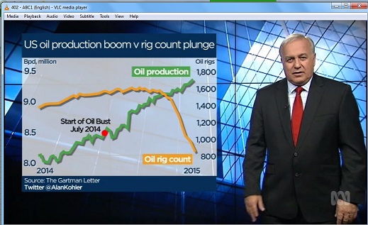
This was even presented in the Australian ABC 7 pm news on 17/3/2015
Fig 5: Business presenter A. Kohler found this graph “interesting”, without further explanation
But will journos and TV presenters have time to read this from Art Berman, a US petroleum geologist:
Misleading IEA Statement Sends Oil Prices Lower and The U.S. Rig Count
March 14th 2015
The IEA (International Energy Agency) made the following statement in its
Oil Monthly Report yesterday that supposedly sent oil prices lower by $2.41 per barrel for Brent and $2.21 per barrel for WTI:
“Steep drops in the US rig count have been a key driver of the price rebound. Yet US supply so far shows precious little sign of slowing down. Quite to the contrary, it continues to defy expectations. Output estimates for 4Q14 North American supply have been revised upwards by a steep 300 kb/d.”
IEA’s comments on U.S. oil production trends are misleading. When IEA says “oil” they mean “liquids” so their number includes natural gas liquids which add more than 3 million barrels per day on top of U.S. crude oil supply that largely come from natural gas production and not from oil production.
Also, IEA is talking about the 4th quarter of 2014 which is history and was unaffected by rig count declines that did not begin in earnest until mid-December.
Or will ABC TV look at the 9/3/2015 EIA
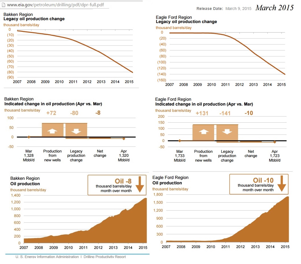
drilling report which shows rampant decline in old shale oil wells (upper panel)
Fig 6: Bakken and Eagle Ford production
The production balance between new wells and legacy wells has turned negative (centre panel), meaning that production is peaking (lower panel).
As an example, let’s put the Bakken balancing trend over time into a graph:
Fig 7: Trendline showing production from new and legacy wells in Bakken
The intersection shows the peak.
To be fair, here is Alan’s website with zillions of interesting graphs:
Including the following, showing the US on the apparent way to energy independence:
Fig 8 A. Kohler: “The world is awash with oil”
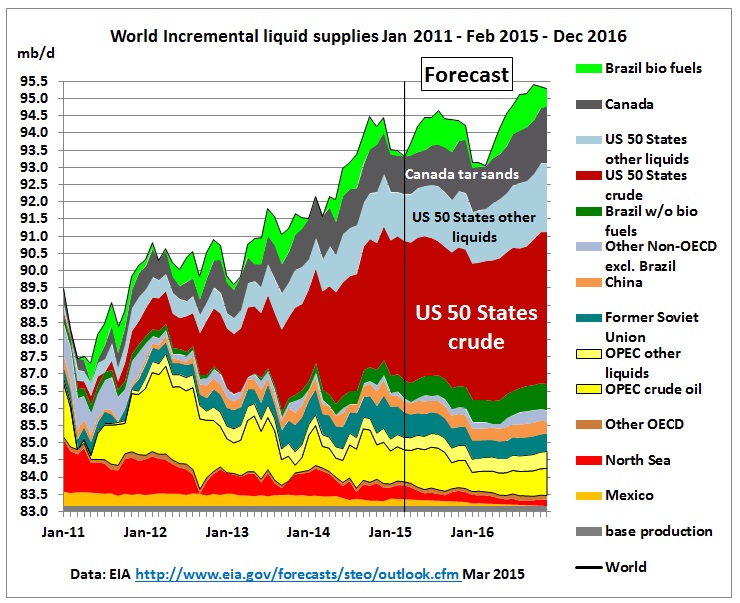
But how will that “awash with oil” story continue? The following graph uses tables 3a and 3b from the above EIA STEO Mar 2015. The steep growth in US crude production – and therefore the world – will be over. Even another increase of US shale oil by end 2016 just brings the world back to where it was in 2014. The only growth will come from US other liquids (not as versatile as crude oil) and Canadian tar sands. And it’s biofuel season in Brazil!
Fig 9: World all liquids production from EIA STEO Mar 2015
No glut of oil outside the US and Canada. (Base production is the sum of the minimum production of all the countries/regions in the legend)
So these are all the liquids the world can muster, including recycled cooking oil used for jet fuels, where Australia is a front runner:
Conclusion:
Feel-good-outlooks make the TV audience happy, but sleepy. They are in line with what the Australian government is doing: building the oil dependent infrastructure of the 21st century: road tunnels, toll-ways and new airports. But expect some surprises
APPENDIX
Alaska is in long term decline
Fig 10: Alaska Crude production
Fig 11: Gulf of Mexico crude production. Deep water oil revolution
GOM production depends on how severe the hurricane seasons are and on possible accidents like the Deep Water Horizon blow out and its consequences for financing and costs of design modifications to drilling and production platforms.
