This article shows CO2 emission profiles from oil, analyses how regional peak oil events shape emission curves and calculates that an annual 6% oil decline rate after 2012 would be needed to satisfy the boundary condition to keep global warming to 2 degrees C, with a 25% probability of exceeding this target.
Climate Institute: “We’re heading towards two to three and four degrees warming and if you think the weather extremes have been dangerous and unsafe, then you ain’t seen nothing yet.” http://www.abc.net.au/news/2013-05-11/carbon-pollution-reaches-highest-point-in-3-million-years/4680276
Keeling curve
The Keeling curve shows CO2 concentrations in the atmosphere:
Zooming in on the last 2 years the seasonally adjusted trend is 396 ppm
CO2 emissions from oil
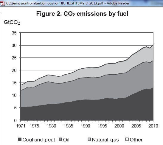
Let’s have a look at annual CO2 emissions from oil (36% of total fossil fuels) as calculated by the IEA in their March 2013 report “CO2 emissions from fuel combustion”. The data go only up to 2010.
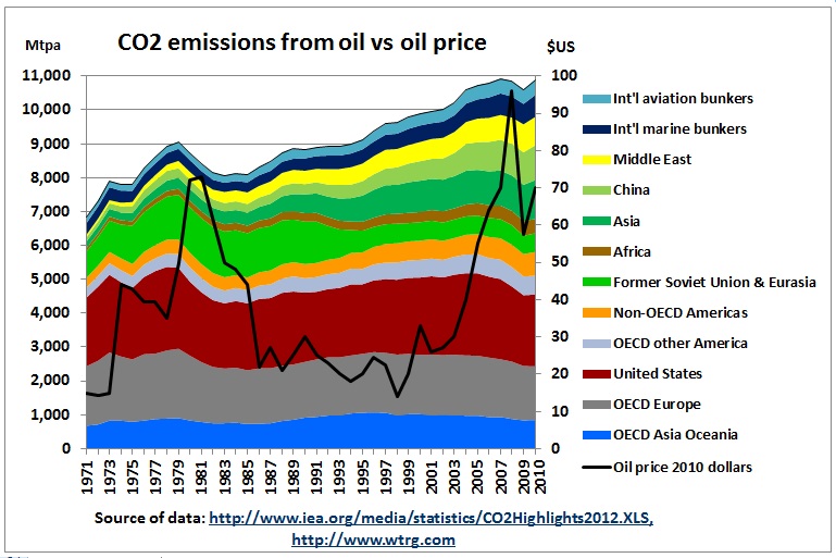
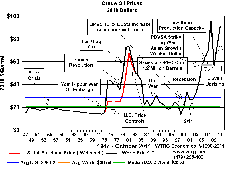
This anomaly was triggered by high oil prices just as in the 1st and 2nd oil crises in the 1970s which can also be seen as flat parts in the emission curve.
The IEA data for emissions from oil are contained in an Excel file, which allow us to put it into a graph:
We see that the 1st and 2nd oil crisis in the 70s brought down annual emissions in OECD Europe and the US via high oil prices. On top of the group with stagnating or declining emissions, following regions have growing emissions: Asia (+2.4 % pa), China (+7.8% pa) and the Middle East (+ 4.8 % pa). Emissions from the transport component of globalisation (aviation, marine bunkers) grew at +3.1% pa.

The collapse of the Soviet Union in the 90s resulted in an emissions reduction of 30% within a short time of 5 years, followed by a stabilisation.
In the following article it was argued that the peaking of West-Siberian oil fields triggered the unravelling of the SU:
4/10/2010 Russia’s oil peak and the German reunification
..

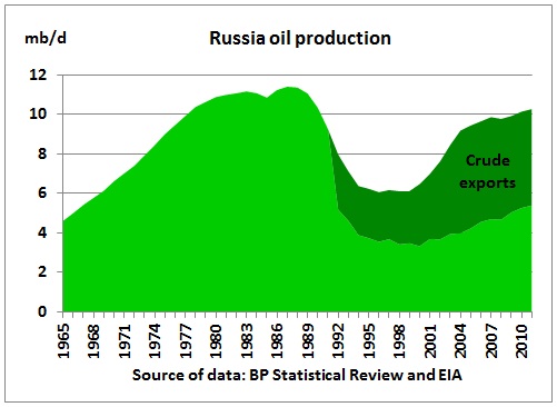
Russia rescued the world from a deep oil crisis during a rebound in oil production starting in 2000, resulting in crude exports increasing by up to 2.5 mb/d. The total incremental amount of Russian exports between 2000 and 2010 was 8 times higher than what Saudi Arabia achieved.
Much of the Russian oil not produced at the time is now produced later. It is difficult to say how production would have continued without the collapse, e.g. with Western oil technology and management available in the late 80s. Under the assumption that the total amount of oil produced was the same, one can guestimate that production now could have been as low as 6 mb/d, pulling the world into a continuing oil crisis, even with US shale oil. According to Jean Laherrere in this article
http://www.theoildrum.com/node/9389 Russia’s 2P ultimate for crude oil and condensate trends towards 220 Gb out of which 156 Gb have been produced. At this high depletion rate of 70% we can expect declining production. As local consumption is increasing, exports are set to decline, too.
As we’ll see in the next para, for the purpose of calculating cumulative CO2 emissions it does not matter much whether oil is burnt a couple of years earlier or later. But for the severity of an oil crisis it matters if and when additional oil flows are available at a critical time. And as we have seen above, a combined financial and oil crisis like in 2008/09 can have an impact on total emissions, including those from other fossil fuels.
Cumulative emissions from oil
The Keeling curve is a cumulative curve measured in nature. So it is of interest to analyse how oil consumption changes show up in a cumulative emissions curve from oil (which is part of the total carbon cycle)
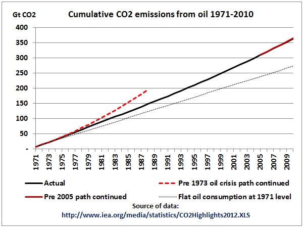
The tyranny of cumulative emission curves is shown in this graph. If global oil consumption had continued flat, at constant 1971 levels, cumulative CO2 emissions would still have reached 273 Gt in 2010, or 75% of the actual figure of 364 Gt (linear dotted line). However, if oil consumption (and oil production) had followed the growth path before the oil crises in the 1970s, emissions would have lifted off on a completely different trajectory. Of course this did not happen as US oil production peaked in 1971 and Iranian oil production peaked in the mid 1970s, events which had a direct impact on the global economy. So we can see that oil peaks shape emission curves.
However, you would need a magnifying glass to discover the 2005 kink in the oil production on the cumulative emissions curve.
This graph is well known and included here as a reminder of what has happened. We can expect more non-linear events to take place in future.
Now that we are at the global oil peak the interesting question is how that will pan out in relation to emissions.
Cumulative CO2 emission scenarios from oil
Let’s do some simplified calculations using following scenarios:
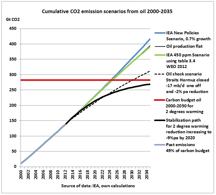
(1) IEA’s New Policies Scenario
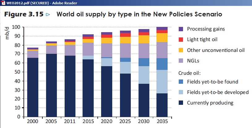
In this scenario of the WEO 2012, tight oil and other unconventional oil allow for growth of around 0.7% pa
Note the decline in currently producing fields, the enormous gap to be filled (fields yet-to-be developed and found) and the increasing role of less versatile natural gas liquids.
(2) Oil production flat
This is for illustrative purposes only.
3 IEA’s 450 ppm scenario
In this scenario, according to table 3.4 of IEA’s WEO 2012, world oil supply will first increase from 86.6 mb/d in 2011 to 90.5 mb/d in 2020 and then drop to 79 mb/d. It is assumed that emissions are proportional to these supply assumptions.
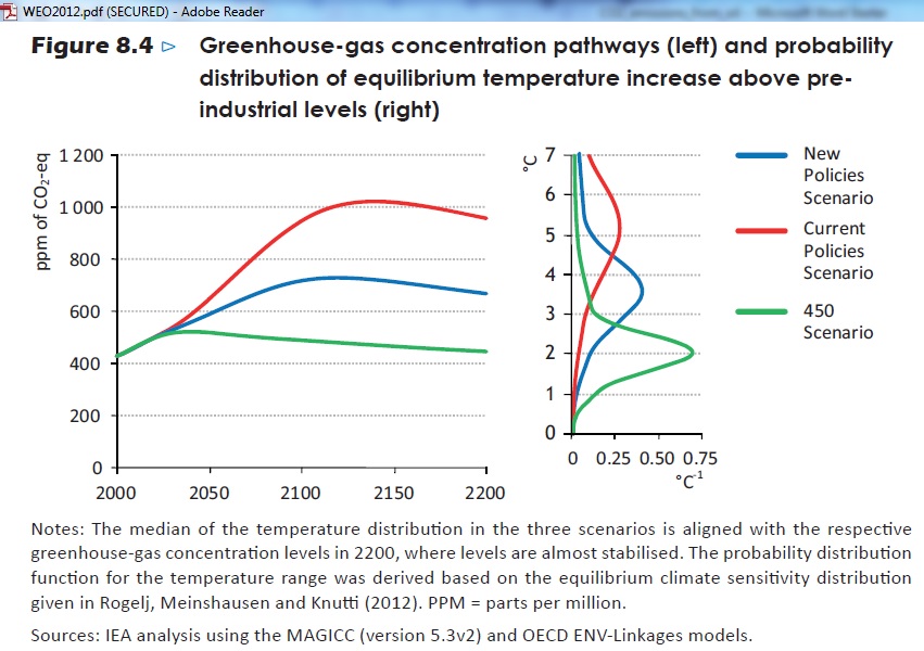
Note that 450 ppm will only be achieved in the year 2200 and that CO2 concentrations will even go up to 500 ppm. This is definitely not a scenario which will keep temperature increases to 2 degrees.
4 Oil shock scenario
In this scenario, 17 mb/d of oil through the Strait of Hormuz is blocked in an oil war in 2014, for an indefinite period. As a result, the financial system goes to its knees and funds dry up to find and develop new oil fields (light blue crude oil columns in Fig 3.15 above). Furthermore, it is assumed that only half of tight oil and unconventional oil is developed due to a continuing recession (red and yellow columns) which leads to an additional reduction of 2 % pa.
5 Limiting global warming to 2 degrees C (25% probability of exceeding)
This is already known since Malte Meinshausen’s Nature article in 2009:
Greenhouse-gas emission targets for limiting global warming to 2 degrees C
“Limiting cumulative CO2 emissions over 2000–50 to 1,000 Gt CO2 yields a 25% probability of warming exceeding 2 degrees C—and a limit of 1,440 Gt CO2 yields a 50% probability—given a representative estimate of the distribution of climate system properties. As known 2000–06 CO2 emissions were 234 Gt CO2, less than half the proven economically recoverable oil, gas and coal reserves can still be emitted up to 2050 to achieve such a goal”
A good description of emission pathways observing these limits can be found in a paper of the Stockholm Environment Institute:
Let’s put the IEA CO2 emission curves from fuels into the key graph of this publication:
IEA’s emissions from fossil fuels are around 78 % of the total. Assuming a continuing percentage of 36% of oil in the fuel mix (no signs of coal phase out yet) we get 280 Gt of CO2 budget for oil in the period 2000-2050. The decline rates for oil after 2013 are adjusted to arrive at the total as follows: linearly increasing to -9% pa by 2020 and then a continuing, progressive decline by -9% pa.
Scenarios summary
We can now put all the scenarios in one graph:
Most importantly, 49% of the carbon budget 2000-2050 has already been consumed in just 12 years! We also see that the IEA’s so-called 450 ppm scenario is in fact a business-as-usual case in which cumulative emissions increase as if production continued flat. The “New Policies” scenario is even worse (what’s new then?). A stabilization path which observes a 2 degree warming limit is fundamentally different as it would bend asymptotically towards the carbon budget limit. The graph also shows that even an oil shock scenario in which the Strait of Hormuz is closed (immediate loss of 17 mb/d), followed by a -2% pa decline brings us into overshoot mode, provided of course the world economy still continues to function, something which is unlikely and would probably mean the end of our carbon based consumer society with a totally different emissions outcome.
Peak oil emission scenarios
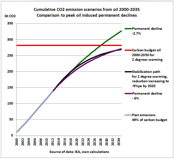
Which hypothetical, permanent decline rate after an assumed peak oil year 2012 would satisfy the boundary condition of 2 degrees warming?
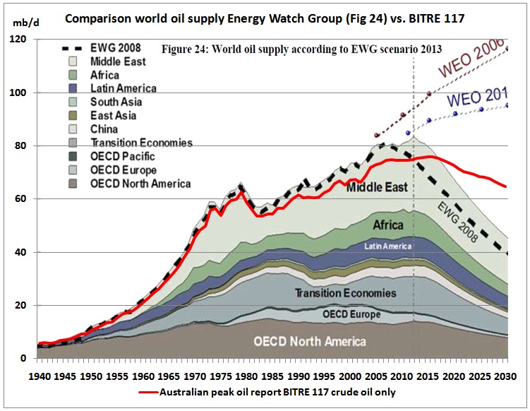
The graph shows it’s around -6% pa. There is no peak oil scenario around with such steep decline rates. The latest research of the Energy Watch Group (EWG) has a decline rate of -2.7% pa to 2030.
.

This graph shows the March 2013 update of the EWG. The Australian peak oil report BITRE 117 (crude oil only, red line) has even lower decline rates.
In this respect, global warming is more critical than peak oil, a point Monbiot made last year in an article in the Guardian when he summed it up: “There’s enough oil to fry us all”
However, we were not wrong on peak oil, which is a process having started in 2005. The response to triple digit oil prices was (and is) a massive quantitative easing program worldwide. In the most oil addicted country of the world, the US, this allowed to develop shale oil (tight oil), now hyped as a new energy revolution. The latest EIA Annual Energy Outlook estimates that a total of 25.3 Gb of tight oil may be produced to 2040, equivalent to just 10 months of current global oil demand.
http://www.eia.gov/forecasts/aeo/pdf/0383(2013).pdf This would generate another 9 Gt of CO2, or 3% of the carbon budget. Whether the EIA is right, is another question. Latest data up to March 2013 from the North Dakota State government show a reduction in growth rates for the Bakken fields
https://www.dmr.nd.gov/oilgas/stats/historicalbakkenoilstats.pdf
Conclusion:
We have a race between peak oil and global warming. Symptoms of these complex processes pop up every now and then. As we can see from the Russian oil production graph above, peak oil (and more importantly, peak exports) is not dead. US tight oil will also peak in this decade as decline rates are very steep. So far most of the peak oil related events like oil wars, refinery & car factory closures and fuel shortages – even in oil producing countries – are regional. But this will change as the problem will spread through the system. On the global warming front of our war with nature an increasing frequency of extreme weather events points to what global warming means and how many lives and money this will cost.
Unfortunately, peak oil with high oil prices is now impacting on the financial system and the fiscal position of governments in a way which slows down efforts to reduce emissions. Oh, and by the way, would decision makers in governments like to work in a building with a 25% probability of collapsing by 2050?
Burning oil image via shutterstock. Reproduced at Resilience.org with permission.

