Renewable energy is winning and coal is on the skids. Disruption of the fossil fuel industry is well under way, and the global energy system is being decarbonised. We’re right on track, right?
To avoid dramatic climate system tipping points, the world needs to decarbonise very quickly and start drawing down the level of carbon in the atmosphere, because it’s already unsafe. As one dramatic example, in past periods when greenhouse levels were similar to the current level, temperatures were 3–6°C higher and sea levels around 25–40 metres higher than in 1900.
So climate warming is now an existential risk to human civilisation, that is, an adverse outcome that would either annihilate intelligent life or permanently and drastically curtail its potential. It is now too late for incremental, measured steps to protect what we care about. Winning slowly is now the same as losing.
So how are we going with our energy system? It is the predominant source of the dramatic human-caused rise in the level of greenhouse gases, which over the last century has increased 70 percent, from 280 parts per million carbon dioxide equivalent (ppm CO2e) to 480 ppm CO2e.
The question is pertinent, with the Guardian reporting last week, “Rise in global carbon emissions a ‘big step backwards’, says BP” on news that global electricity emissions rose 1.6% in 2017 after flatlining for the previous three years, despite renewable power generation growing by 17% last year, because “strong economic growth led to above-average energy demand, coal use bounced back in China and efficiency gains slowed down, causing emissions to jump”.
And there was this from China:
Monstrous industrial numbers in May in China: thermal power generation +10% on year, crude steel +9%, coal production +4% https://t.co/g3cE5HlHsy
— Lauri Myllyvirta (@laurimyllyvirta) June 15, 2018
Here’s the story in six easy charts.
1. Cost of new electricity generation
 |
| Chart 1: Average energy cost in North America |
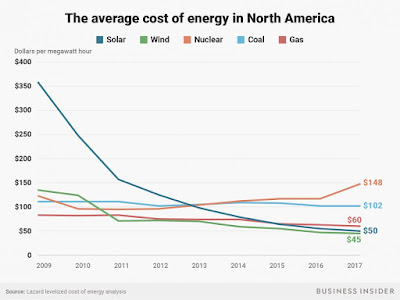
The revolution in the cost of solar energy has upended the electricity market. This chart of Lazard’s Levelized Cost of Energy, courtesy of Business Insider, shows that in North America, the cost of electricity from new installations of solar (without storage) and wind, at $50 and $45 per megawatt hour respectively, are cheaper than gas, half the cost of coal ($102) and one-third the cost of nuclear power ($148). The same fate has befallen coal in Australia.
2. Coal closures
 |
| Chart 2: Coal additions and retirements |
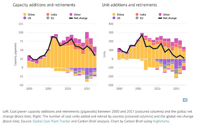
This image from Carbon Brief tells the story of coal’s declining fortunes. At left are coal power capacity additions and retirements in gigawatts between 2000 and 2017 (coloured columns) and the global net change (black line); at right the number of coal units added and retired by country (coloured columns) and the global net change (black line). (Source: Global Coal Plant Tracker and Carbon Brief analysis. Note on these graphs, for clarity, the vertical axes are capacity change (left) and unit change (right).)
The IEA says global coal investment has already peaked and is now in a “dramatic slowdown”. This fall in investment means coal capacity growth is slowing, as the left chart shows, but it is still positive. The number of new plants under construction each year is falling faster, down 73% since 2015, according to the latest annual status report from CoalSwarm, Greenpeace and the Sierra Club, so that now new plant openings are offset by plant closures. All this means that global coal power capacity could peak as soon as 2022, the status report says.
3. GDP and energy growth
 |
| Chart 3: Global GDP, energy demand and energy-related emissions |
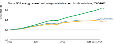
This chart from the International Energy Agency’s Global Energy & CO2 Status Report 2017 shows global production (GDP) has grown around 80 per cent since 2000 (green line), whilst energy use has increased at only half that rate, around 40 per cent (yellow line). So the world is becoming more efficient at using energy.
But what is troubling here is that energy-related carbon dioxide emissions (blue line) grew at about the same rate as energy use. This graph suggests that there has been no improvement in the carbon intensity of energy this century. Is this true, and how could it be so?
4. Energy use by sector
 |
| Chart 4: Global energy consumption |
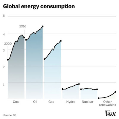
One clue is this useful chart of energy use by sector from 2000 to 2016, based on BP data, and recently published by Vox. Coal consumption has peaked and is falling, but oil use is rising, and gas even more so; nuclear is down and renewables are shooting up from a low base. So it’s not hard to see that the overall emissions intensity of energy production has not shifted very much. Gas in particular is enjoying a boom as it is substituted for coal in the power industry, and as a heat source in the industry sector. As well, gas is the feedstock for the global chemical industry, including all those plastics and related petrochemical products ubiquitous in clothing and household appliances, electronics and cars.
5. Global energy trends by sector over the last 50 years
South Australian-based engineer Shane White has been looking at the recent energy data. It’s a difficult problem of comparing apples and oranges, because the output of wind and solar farms, hydro and nuclear is measured in kilowatt hours of electricity, whilst coal, oil and gas have traditionally been normalised in tonnes of oil equivalent (toe).
 |
| Chart 5A: Global energy consumption 1965-2017 |
Traditionally, says White, BP and others convert the non-fossil fuels including renewables and hydro from kilowatt hours to tons of oil equivalent. To do this they have a trick: they assume that the same amount of energy would otherwise be generated by a plain old coal fired power station with an efficiency of 38%. The lower that efficiency figure is, the higher the non-fossil fuel generated energy appears to be, and the rosier our decarbonisation outlook.
But an alternative and experimental approach that avoids the above assumption, says White, is to convert all the energy sources into that most basic energy unit the joule (J). We know the embodied energy of oil, coal and gas in units of Joules. And for non-fossil electric sources, it’s very simple, because one kilowatt hour is equivalent to 3,600J.
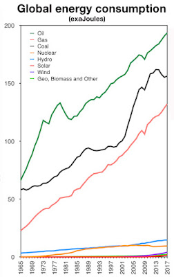
Using this method, White analysed the data and came up with two stunning charts. The first is global energy consumption by fuel type 1965-2016. Here we can see more clearly how expanding oil (deep green) and gas (red) are still dominating global energy use, expanding more rapidly than all non-fossil fuel sources combined (Chart 5A). The chart is also presented in a stacked version (Chart 5B). White’s full analysis is available here.
 |
| Chart 5B: Global energy consumption 1965-2017 (stacked) |
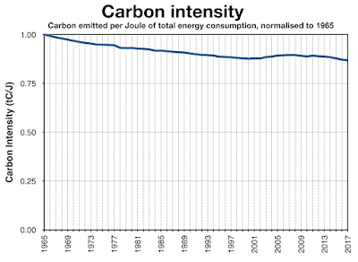
In a second chart (Chart 6A), White has plotted the carbon intensity of energy used (carbon emitted per total energy consumption in Joules), showing that over the last 50 years the emissions intensity of energy used worldwide has fallen around 13%, or an average of one-quarter of one per cent a year. And like graph 3 above, there has been little overall improvement since the turn of the century. Whilst over the last few years it has decreased significantly, it doesn’t even offset the re-carbonisation in the first decade of the century, perhaps attributable to rapid Chinese growth of the back of some very dirty coal power stations that consumed Australian coal.
 |
| Chart 6A: Global carbon intensity of energy 1965-2017 (1965 = 1) |
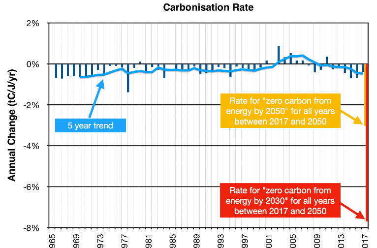
And the big picture? Despite 25 years of global climate policy-making, decarbonisation rates are not even close to what is required. Global policy-making often bandies about a goal of full decarbonisation by 2050. That’s miles too slow, because today we have no carbon budget left for 1.5C, and none left for 2C either from a sensible risk-management perspective. But how do the 2030 and 2050 goals compare to present rates of decarbonisation. Chart 6B tells the story.
 |
| Chart 6B: Decarbonisation rate |
The decarbonisation rate should improve with renewables now having eclipsed thermal coal in cost competitive terms, but renewable expansion is coming off a very low base, as is illustrated in Chart 5. The continuing acceleration in oil and gas consumption is deeply disturbing. We are still a long way from where we need to be in the energy transition, and the task now truly needs “all hands to the wheel”.


