In an interview with ASPO USA in January 2014 Ex-Saudi Aramco geologist Dr. Sadad-Al-Husseini predicted oil price spikes of $140 by 2016/17. This post shows some graphs explaining why this could happen.
Husseini: My base oil price forecast in 2012 dollars still ranges between $105 and $120/barrel Brent with a volatility floor of $ 95/barrel and more probable upward spiking to $140/barrel within 2016/2017.
Husseini did not elaborate how he arrived at that time frame but this question and answer give us a hint:
ASPO: “In the larger context, how has your view of future world oil production supply evolved over the last four or five years? As a benchmark, I reference your slides from the 2009 Oil & Money Conference slides”
Husseini: “The realities of the 2009 O&M forecast of a limited plateau of oil supplies have been pretty much vindicated since then. The oil plateau may now be inflated by about 1 – 2 Mbd of high cost unconventional oils but all major forecasters see this as pretty much transitional. The plateau itself remains a reality and unfortunately its duration is still unlikely to extend beyond the end of this decade.”
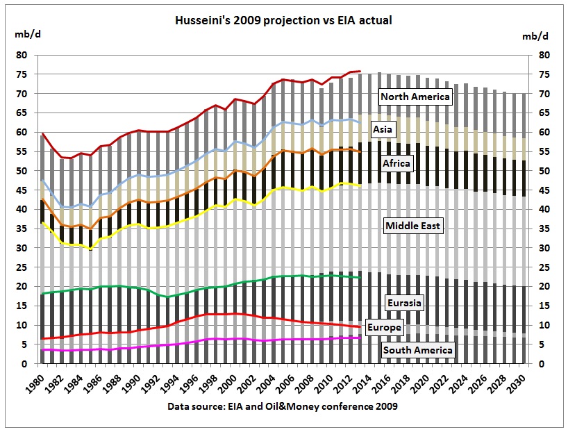
So how did Husseini’s 2009 plateau look like and how does it compare with actual production data? The slides are contained in a presentation titled “Structural realities that define the oil supply outlook”
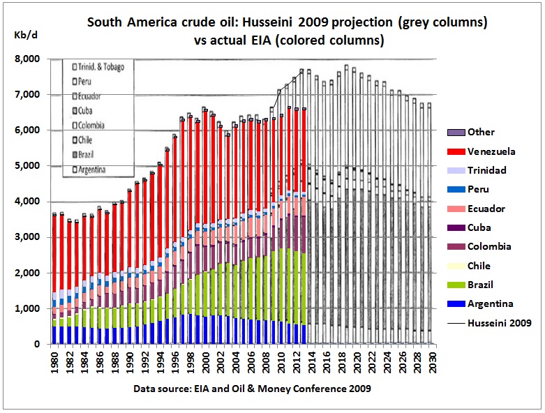
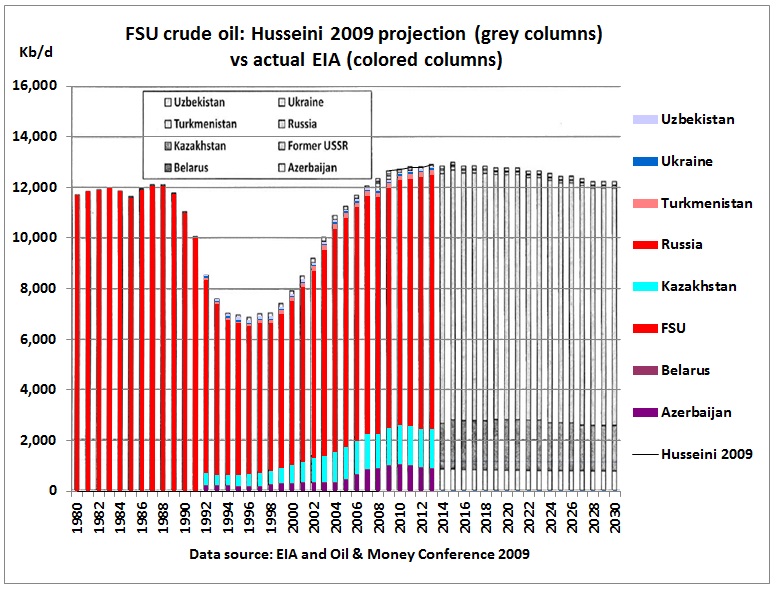
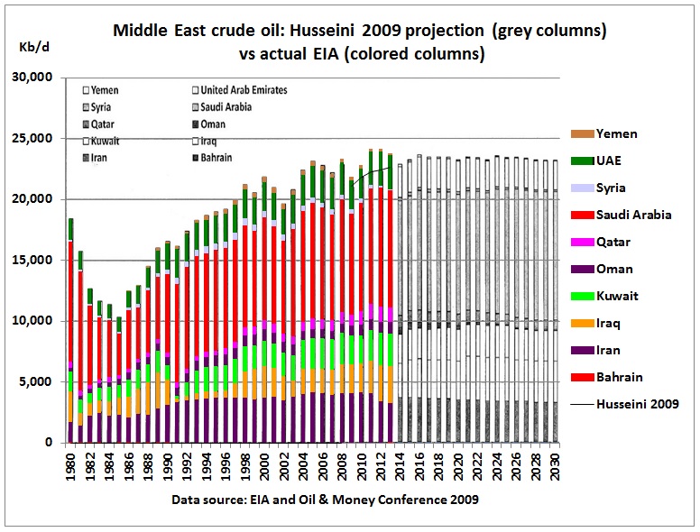
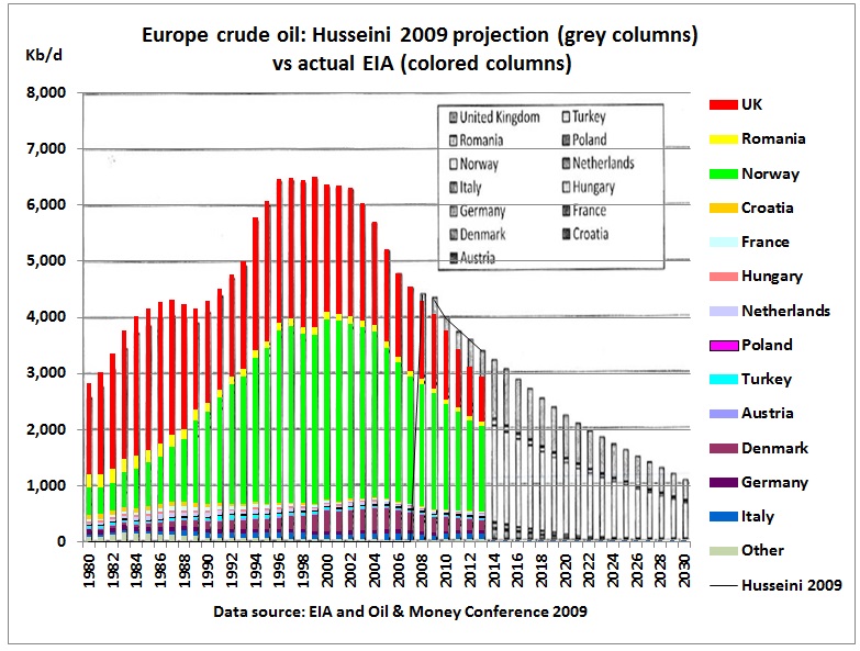
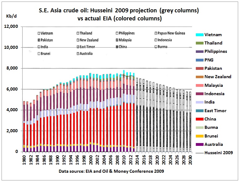
This was done continent by continent and country by country. In the following graphs, the grey shaded columns are from Husseini’s 2009 projection and the colored columns represent actual production (data from EIA).
Central and South America

Actual production in 2013 was 1 mb/d less than in the 2009 projection, mainly due to limited Brazilian production.
Europe
Actual production in 2013 was 460 kb/d less than in the 2009 projection, mainly due to higher decline rates in UK.
Former Soviet Union

Actual production in 2013 was slightly less (80 kb/d) than in the 2009 projection due to weaker output in Kazachstan. Note that crude oil production in West Siberian fields peaked in the mid 80s, triggering the collapse of the Soviet Union.
Asia
Actual production in 2013 was 300 Kb/d higher than the 2009 projection mainly as a result of higher production in China.
Africa
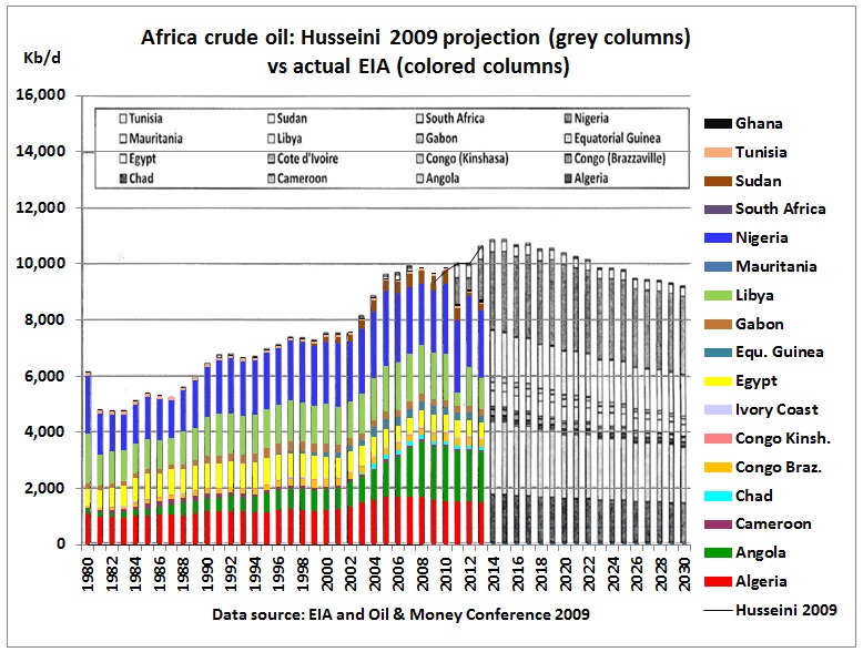
The 2009 projection estimated a peak of around 11 mb/d in 2015 but actual production in 2013 was only 8.7 mb/d or 1.9 mb/d less than projected for that year. Production was less in Angola, Algeria, Libya and Sudan.
Middle East

Actual production in 2013 was 1.2 mb/d higher than in the 2009 projection. While there was an actual decrease in Iran, Yemen and Syria (together -850 kb/d), this was more than offset by an increase in all other countries including Iraq (+ 440 kb/d), Kuwait (300 kb/d), Qatar (250 kb/d), Oman (290 kb/d), UAE (220 kb/d) and Saudi Arabia (+ 540 kb/d).
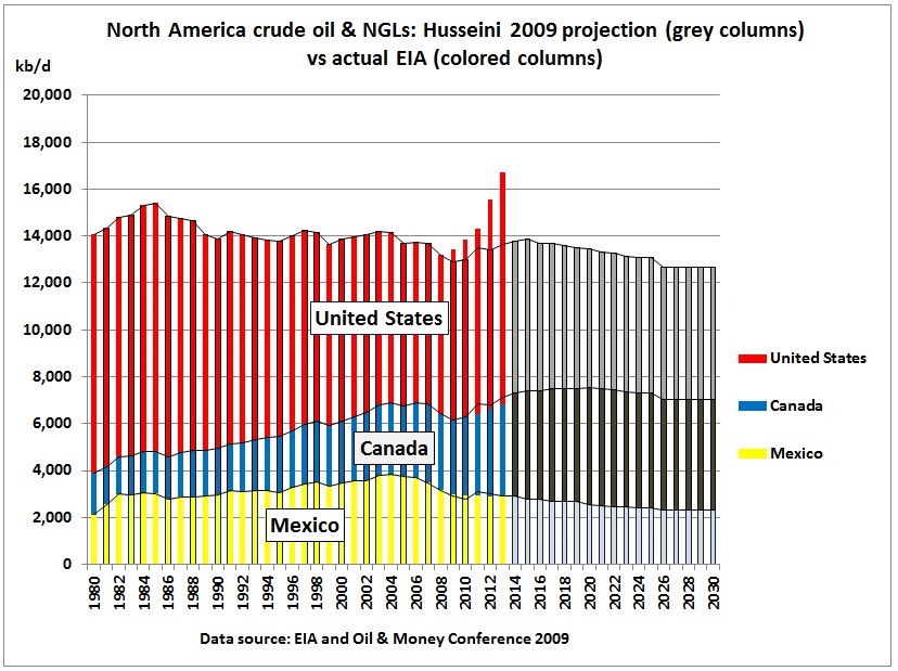
North America
While in the above all of Husseini’s underlying 2009 graphs relate to crude oil, the North American graph includes NGLs .
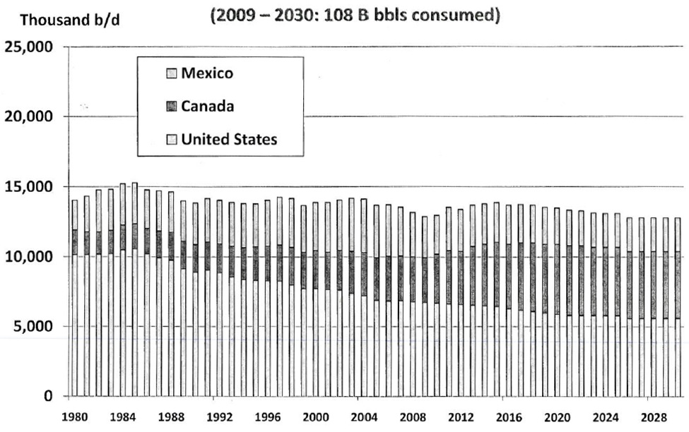
First, we need to re-stack the columns to show the impact of shale oil:

For 2013, Husseini’s projection for Mexico was spot on and for Canada slightly over-estimated. The big difference is US shale oil, 3.3 mb/d, but that contains NGLs because shale oil is a very light oil as we have seen in recent fires in oil train accidents.

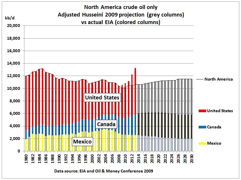
The uptick in crude was less, around 2.6 mb/d. So Husseini’s North America projection for crude and NGL has to be adjusted by the ratio crude/(crude+NGL).
All together now.

We see that total actual crude production was slightly higher than Husseini’s forecast, 600 kb/d or 0.8% in 2013, a small percentage in view of all the uncertainties. As is usual for estimates there is a lot of plus and minus.
The biggest difference is the unforeseen increase in US shale oil which was, however, cancelled out by too optimistic forecasts for Africa and South America.
So how might Dr. Husseini in his interview have come to oil price spikes in 2016/17?
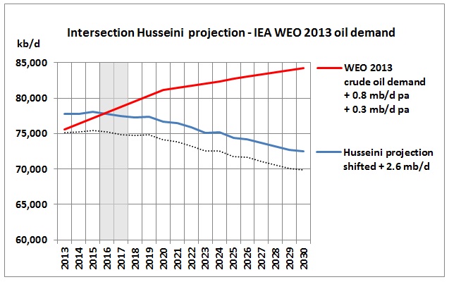
Let’s adjust his original 2009 projection as follows: + 600 kb/d to bring projected production into line with actual production in 2013, then shift his projection by a further +2 mb/d to add unconventional oil as mentioned in the interview.
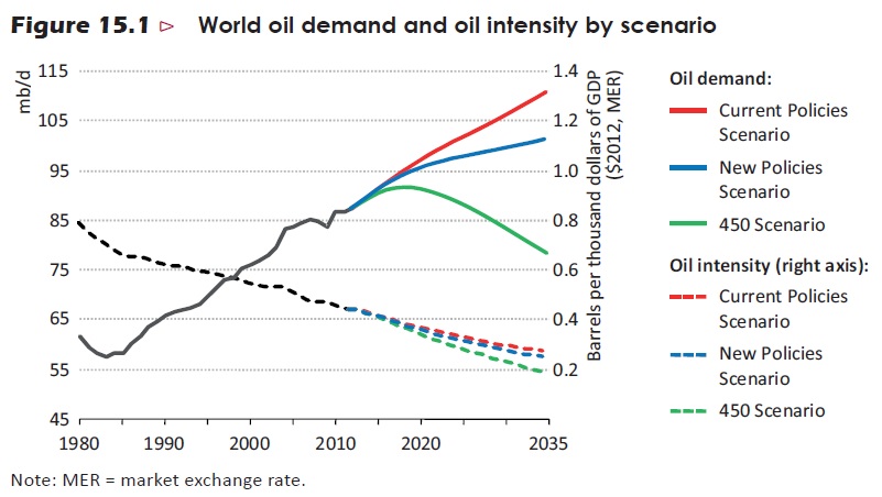
On the demand side, let us take the long-term view of the IEA WEO 2013 (p. 501): “Demand for oil grows from 87.4 mb/d in 2012 to 101.4 mb/d in 2035 in the New Policies Scenario, but the pace of growth slows steadily, from an average increase of 1 mb/d per year in the period to 2020 to an average of only 400 kb/d in the subsequent years to 2035”.
So for crude oil this means +800 kb/d pa until 2020 and + 300 kb/d pa thereafter. Let’s put that into a simplified graph:
We see that the intersection point is somewhere in 2016. What is more important than the precise year in which the next oil crunch may happen is the widening gap in the 2nd half of this decade.
Conclusion:
Whether the world wants to follow the New Policies Scenario of the IEA WEO 2013 is another question altogether. It seems governments are rather on a current policies track which increases oil demand and therefore pressure on oil prices.
Oil dollars teaser image via shutterstock. Reproduced at Resilience.org with permission.
